For most of my career, the expensive part of design was getting a first version into the world. A flow took days in Figma, a prototype took a week, and seeing anything move in a browser meant asking an engineer for time they didn't have. Restraint came partly for free. You made fewer things because each one cost more.
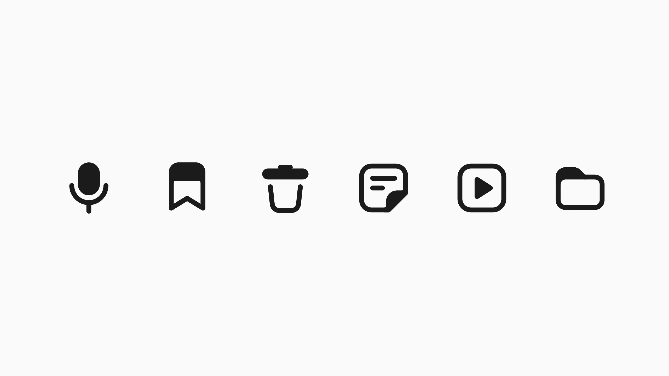
That cost has dropped. Trying an idea is much cheaper than it was: a few directions for an icon set in an afternoon, a rough prototype to test a hunch before it goes into a meeting. Building something good hasn't become cheap. It still takes engineers who know where a system breaks and designers who know why a screen works, and no tool did that part for me. What changed is the price of the first draft, and the first draft is where most of the “more” comes from.
What the cost was doing
I don't miss waiting a week to see an idea move. But that cost was doing a job nobody had assigned it. Every feature had to survive an estimate. Every variant had to be worth someone's afternoon. A lot of weak ideas ended quietly there, before anyone had to say no to them.
With cheaper drafts, fewer ideas end on their own. The fifth option is nearly as easy as the first, the twelfth setting as easy to add as the third, and a product grows the way a drawer does: one reasonable thing at a time, until nothing can be found in it. The no that used to come from the budget now has to come from someone.
Done isn't good
Katie Dill, who leads design at Stripe, has a name for what this produces: zombie UI. Interfaces that work, look finished and could belong to anyone, because nobody stopped to edit them. Her explanation is the most useful I've heard. The filter used to sit before the build: scoping, wireframes, critique, the plain lack of time. Now the build comes first, and the filter has to run after it, when the thing already moves on screen and throwing it away feels like a loss.
She compares it to a microwave burrito: ready in ninety seconds, and so impressive for that alone that you stop noticing how it tastes. The feeling of having made something has become stronger than the feeling of having made it well. Her advice to teams is short.
Refuse to confuse done with good.
At Stripe, one designer reworked a single event animation fifty-six times. The first version came fast. The other fifty-five were the work.
Minimal isn't simplistic
There's a complaint going around that minimalism is flattening everything, that every product now looks the same pale grey. I don't think minimalism is the problem. Simplism is: taking things away until a screen looks calm, without understanding what they were there for.
Minimalism is close to the opposite of that. Saying a whole idea with very little is one of the hardest things in visual work. It means knowing the idea well enough to find the two or three marks that carry it, and when it works, the payoff is large: a symbol people read in an instant, a screen that explains itself. Simplism only looks like that from far away.
The less I care about is measured on the other side of the screen: fewer things a person has to understand, fewer states they can get lost in, fewer choices that were never theirs to make. A busy screen can do that well. A sparse one can fail at it completely.
More or less
The old phrase has a hedge in it, and I've come to like the hedge. Sometimes more is the answer. A tool for experts should be dense. A table should show the data instead of hiding it behind a “see more”. Restraint that strips a screen of what people came for isn't restraint. It's just less.
So less isn't a rule. It's the direction I lean when I can't tell, and the lean has to be justified every time. More or less.
The job now
If drafts are cheap, more of the work moves to either side of them: deciding what's worth making, and deciding what to let go. Taste used to get some help from what we could afford to build. Now it has to work with less of that help, which is harder, and more honest.
When I redrew Galleri's icons, I looked at thirty-nine sheets of options. Much of my part was saying no, precisely and in writing, and then adjusting by hand the details no rule could reach. Those were the parts no tool could do for me. I think a lot of design work will feel like that for a while: plenty of options, and the value in knowing which ones to refuse.
The friction didn't disappear. It moved. It used to live in the cost of making things; now it lives with whoever is deciding. If we don't bring it, nothing will.