A while ago I tried to get a model to generate icons for the Lumx design system. The first few dozen were fine. Somewhere past fifty the set stopped being a set: weights drifted, corners disagreed, and every new icon matched the prompt while matching none of its neighbours. I put it down.
Galleri had the same problem from the other side: icons from three sources (a Lucide-style set, some Figma exports, a few drawn by hand) that had never been in a room together. With Opus 5.5 out, I gave it another go. This time it held, all 108 of them. The model is better at geometry, but that isn't most of why.
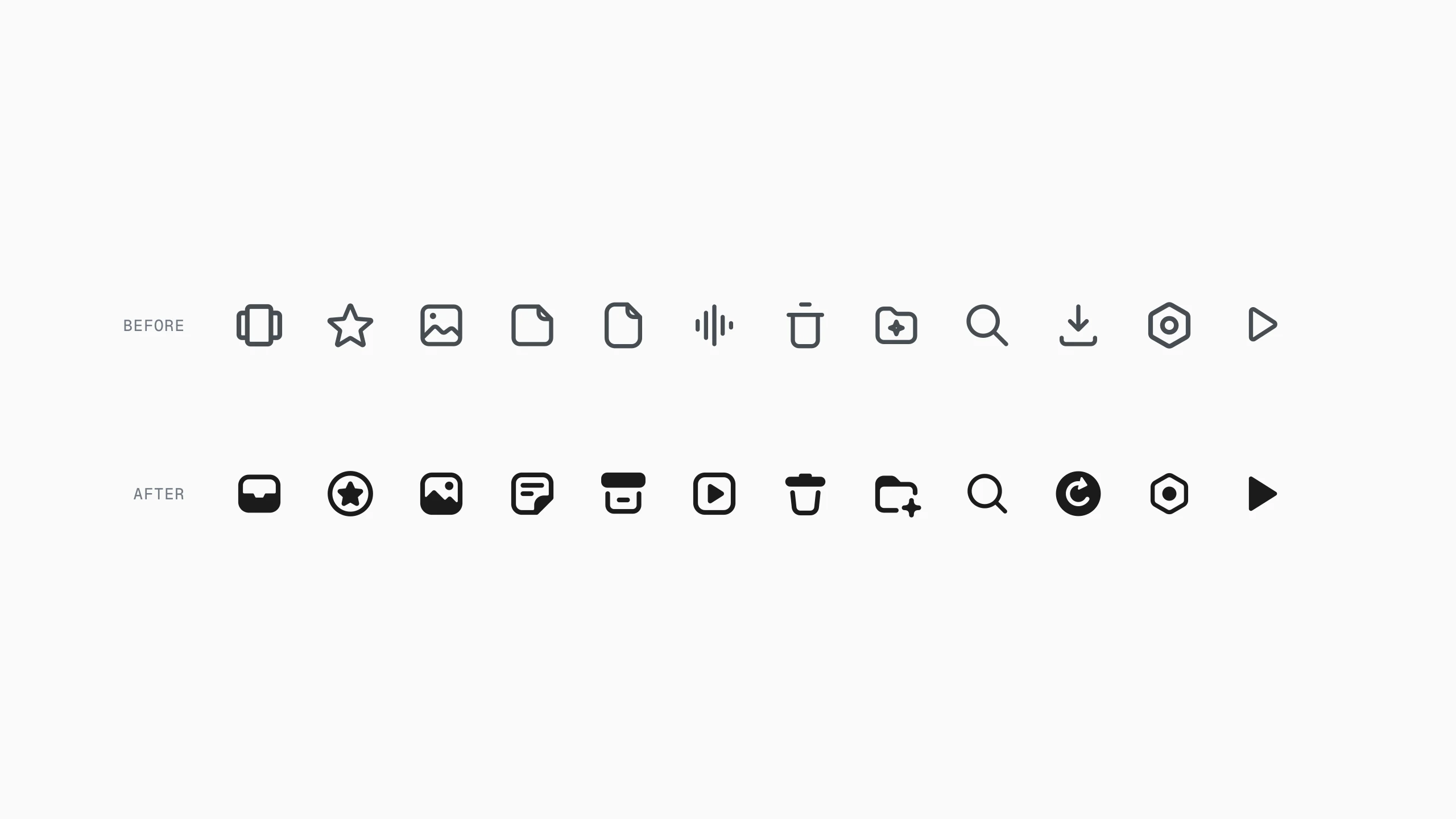
What broke last time
Consistency isn't a property of an icon. It's a relation between icons, and a prompt can't hold relations. Every generation decided the corner radius again, and the stroke, and how a line ends near a badge. Fifty icons is fifty chances to decide slightly differently, and the drift compounds, because each new icon is checked against a description rather than against the set.
So this time nothing was drawn alone, and nothing was decided twice.
Icons as specs
None of the icons is freehand path data. Each one is a spec on the 24 grid, built from shared helpers: rounded boxes, arcs that end in a head, lines that stop a measured distance short of a mark. A radius lives in a function, so it gets decided once.
const SIDE = { folder: { s: [FOLDER_LINE], f: [FOLDER_TAB] }, favorites: { s: [RING], f: [star(12, 12.5, 5.25, 2.5)] }, files: { s: [BOX_OPEN, SLOT], f: [rr(2.5, 3, 19, 5, 1.75)] },};s is stroked, f is filled, and that second key is the whole visual language.
One filled piece
The first sheet put five systems side by side on four sidebar icons: outline only, an outline with one filled part, a solid with the details cut out, and two that swapped the metaphor entirely. Every option was shown at 16px beside its real neighbours, in light and in dark, because an icon on its own tells you nothing about weight.
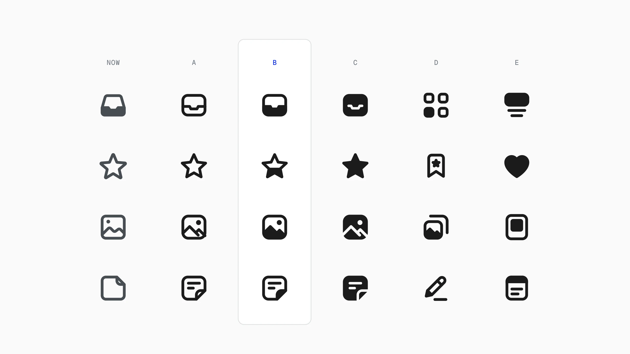
B came with a condition: the filled part has to be a real piece of the object. The mic's capsule, the bookmark's band, the bin's lid, the note's fold, the folder's tab. Never half a star, and never a band across a page because the page looked empty.
That sentence did more for consistency than the grid did, because it hands the model a question to answer for every new icon: which part is this? When there was no good answer, the icon was wrong.
Every no is a rule
From there the loop was plain. Opus drew a sheet with two to five options per icon; I marked up a screenshot and sent it back. Thirty-nine sheets, ninety-six screenshots.
What made it scale is that every rejection got written down, with a number, in a guide, GUIDE.md, that the model reads before it touches an icon. Icon 90 obeys a note I left on icon 6. That file is the difference between this and Lumx.
The first smart folder cleared room for its sparkle with a circle. My note was to offset the secondary mark instead. In the guide it became: any cut is the mark's own outline grown by 1.75 units, and a line that meets a mark ends there, with a round cap.
Inside corners went the same way. Where a fill meets a line, ink pools at 16px. The first fix used radii from 1 to 2.5 and inflated everything. The guide now says 0.45 to 0.6, with the reason next to the number.
Written rules also catch the model drifting. Halfway through, new icons stopped getting the softened corners. The note back was five words long, and from then on it was a line in the file rather than something either of us had to remember.
Tried Verdict LessonInner radii 1 to 2.5 too round 0.45 to 0.6Circle around a mark offset it Grow its outlineHeads pasted on arcs not one shape Square to the tangentLeaf, coffee, rocket hated Retired, remappedVery round cube (unprintable) Hexagon, counters 0.6Measured, not eyeballed
Most of those rules are distances, and distances can be computed. A line that stops short of a mark isn't trimmed by eye. The helper, trimDash, samples the mark, walks the line in steps of 0.05 units, keeps the points at least one stroke plus the gap away, and returns the result as a dash pattern on the original path.
function trimDash(d, marks, sw = SW) { const D = sw + GAP; const mark = marks.flatMap((m) => samples(m, 0.1).pts); const { L, pts } = samples(d, 0.05); const keep = pts.map(([x, y]) => nearest(mark, x, y) >= D); return { d, dash: runs(keep), offset: L - firstKept(keep) };}One path, round caps intact, and the cap lands exactly the gap away from the mark at any weight. Arrowheads on arcs work the same way: the head's base is centred on the arc's end and set square to the tangent there, so line and head read as one stroke instead of a triangle pasted on at a slightly wrong angle.
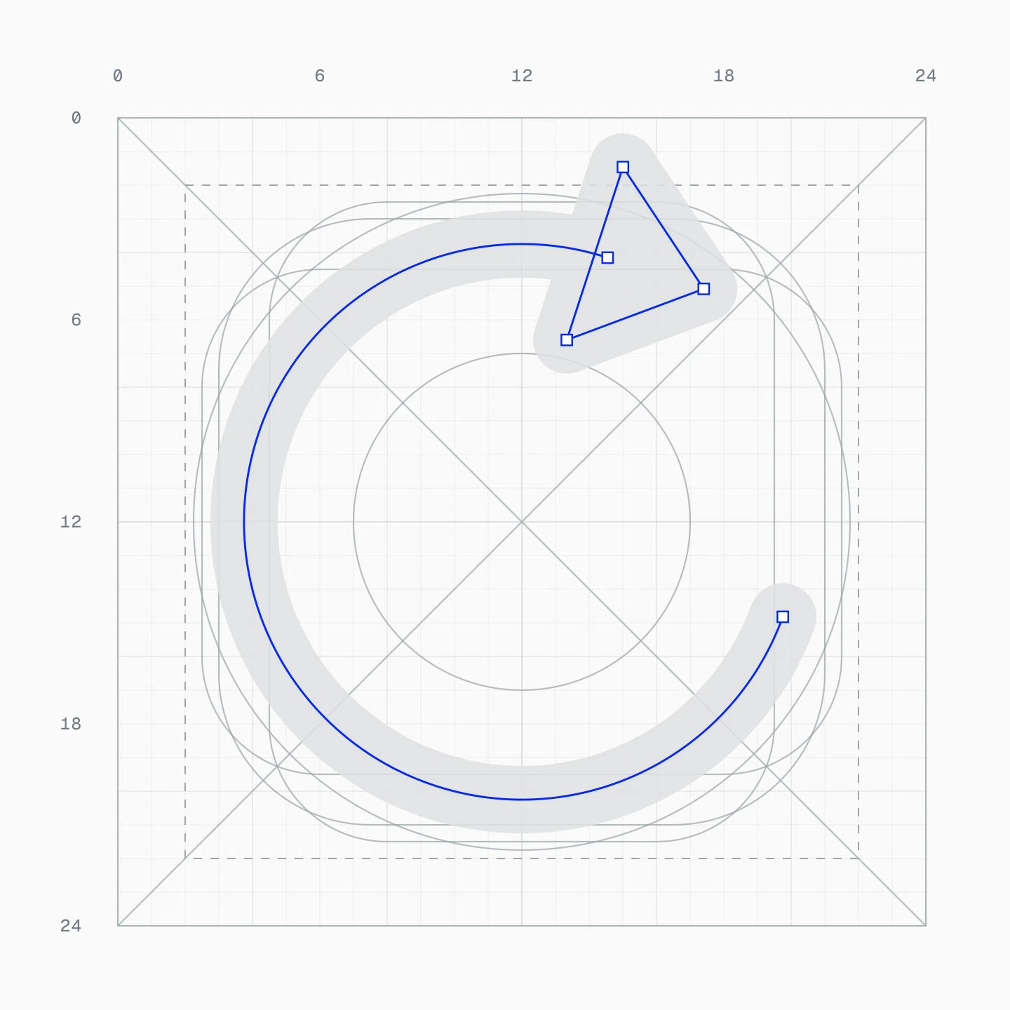
Weight is a measurement too. On screen, the stroke matches the stem of the Inter label beside it, 0.107em at weight 500, which is 1.5px next to a 14px label. Drawn at 16px in the sidebar that's 2.25 units; menus and the editor sit beside other labels, and get 2 and 2.75. The same icon carries a different weight in every place it's used, and the table lives in the guide with everything else.
Where taste ran out
The model's defaults are the average of every icon set it has seen. For the icons people pick for their own collections it offered a leaf, a coffee cup, a rocket, a shirt, a camera, a palette and a house: well drawn and completely wrong. Galleri's users are designers sorting references, and nobody files their references under coffee.
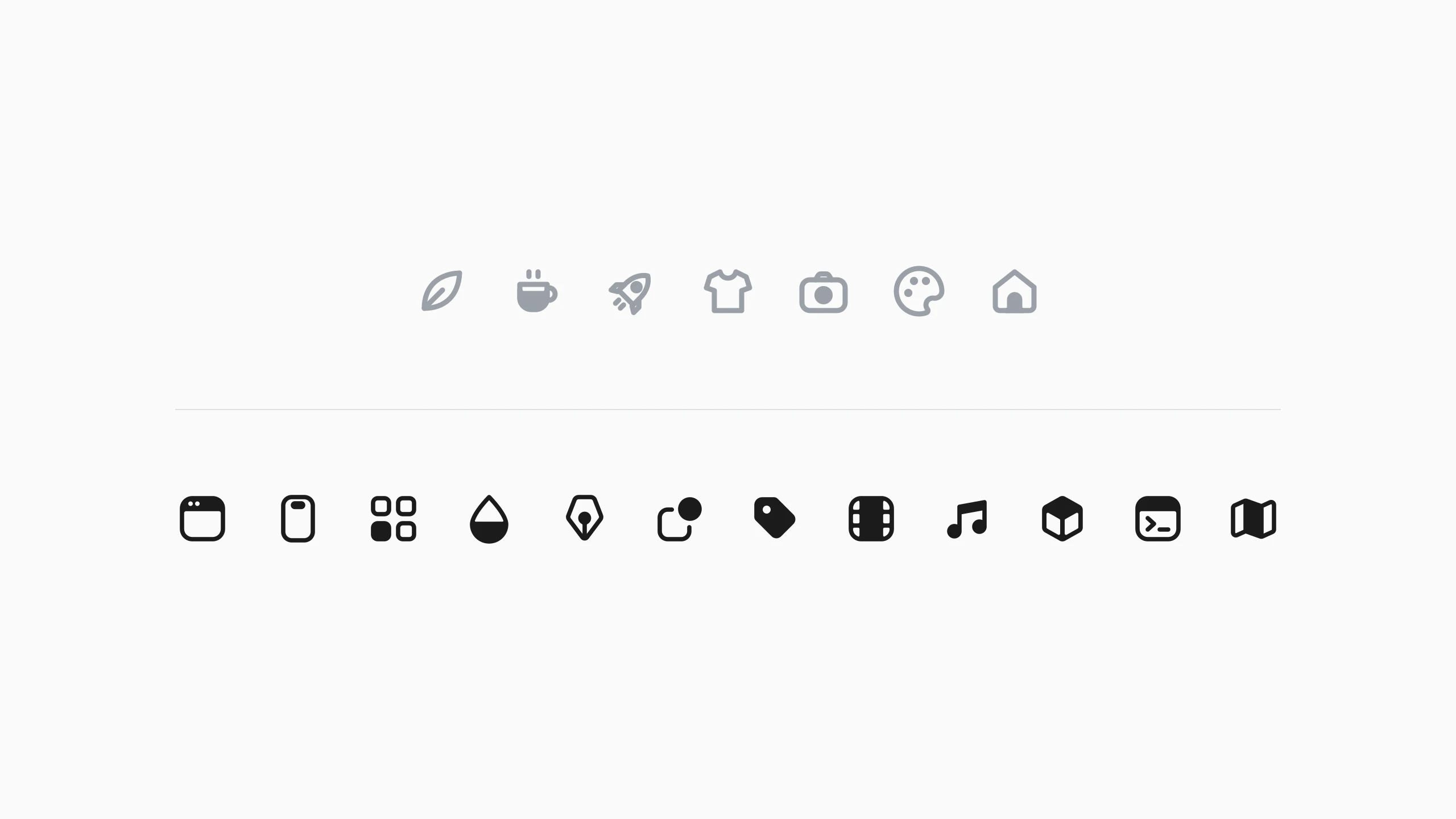
The set became web, mobile, layout, colour, illustration, shapes, branding, motion, sound, 3D, code and maps, all on the folder's skeleton. Typography was tried twice and dropped. That call had nothing to do with geometry. It's knowing who the app is for, and it's the one part of this I wouldn't hand over.
Review at ten times
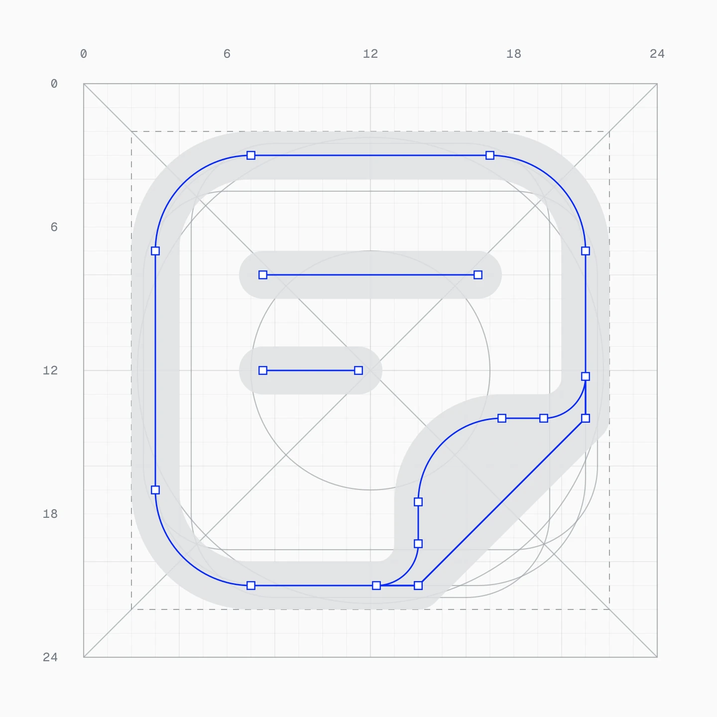
For this post I asked for one blueprint card per icon, like the two above. They turned into the QA pass. A folder with one sharp counter corner and one radius off by half a unit. An arrow cut out of its circle by the outline alone, so the head came out hollow. A mountain meeting its frame at a sharp corner. None of it visible at 16px.
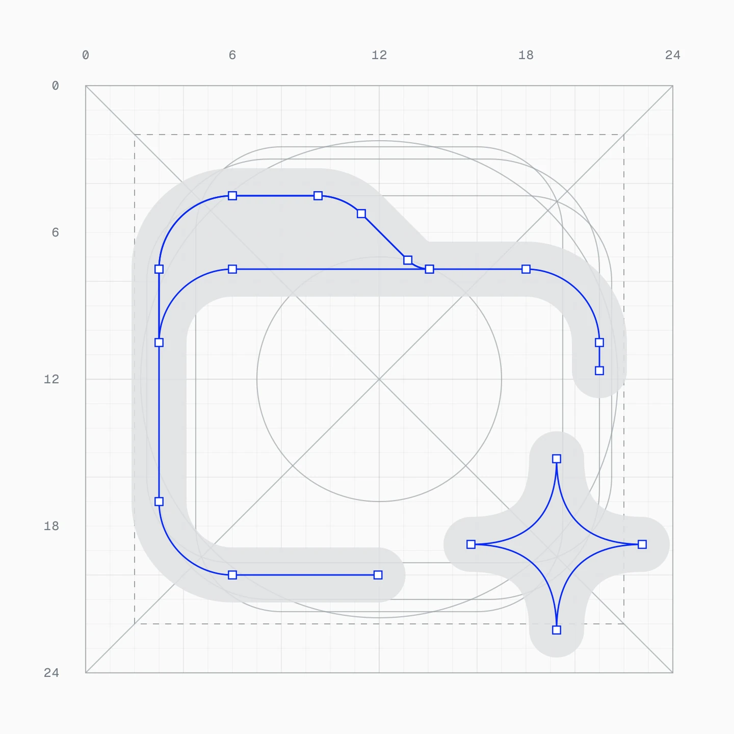
icons.jsx is the only source. An export script outlines every stroke with Skia's path ops, unions the parts and subtracts the masks, so each icon also exists as one flat path for Figma. At Skia's default precision the curves came out flattened to a quarter unit, and one ring was visibly dented; at precision: 100 it's exact. A pixel diff at 240px now compares every stroked icon with its outlined twin, and a script flags any cut-out masked by its outline alone. Review that runs on every batch beats review that depends on someone squinting.
Why it held
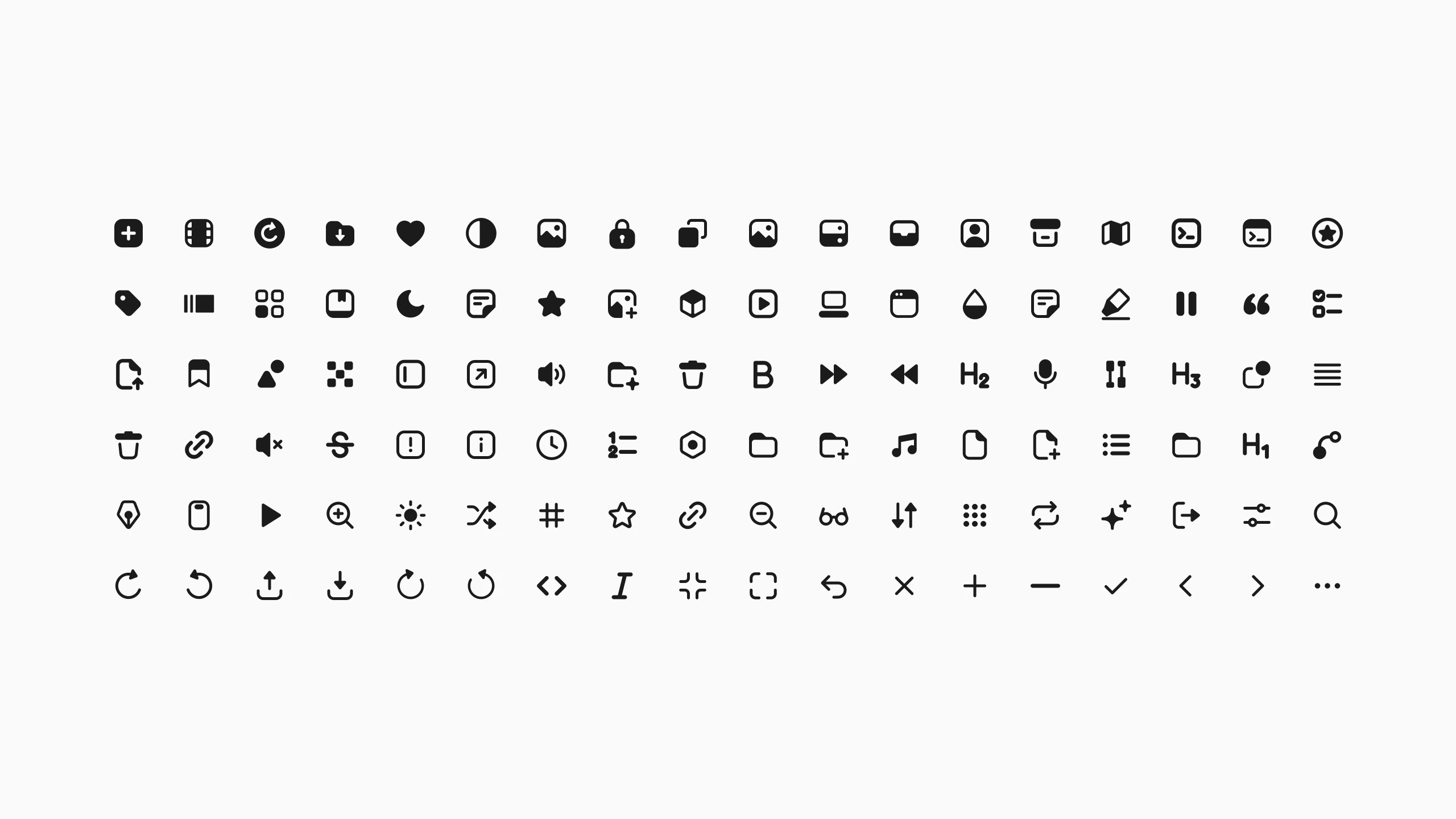
Looking back at Lumx, the model wasn't the only thing missing. I asked it to be consistent and gave it nothing to be consistent with. Galleri's set had a memory: a 246-line guide, a helper for every decision that repeats, and a sheet that never showed an icon without its neighbours. Opus drew, the guide remembered, and I said no, precisely and in writing.
It isn't perfect, and I know it. Sort the set by ink, as above, and the swing from the solid tiles to the thin chevrons is wider than I'd like. Menus and the top bar still sit at 2 units while the small places moved to 2.25. There are corners I'd still nudge by hand.
But perfect was never what this round was for. What changed is the price of an option. Five complete systems for the same four icons is days of drawing by hand; here it was a request, and throwing four of them away cost nothing. Exploring stopped being the expensive part.
Next is the part that stays manual: a pass over the outlined exports in Figma for the details no rule reaches. Then the library grows, and the guide grows with it, so icon 150 obeys a note I left on icon 6.
And if I start Lumx again, I'll start with an empty GUIDE.md.