Every project starts with too much. Too many colours on the board, too many weights in the type, too many ways for a button to say it has been pressed. The work is not adding the last thing; it is finding out which of the first things were never needed.
That is not a complaint about the first week. The first week should be loud. It is where the options live, and an option you never saw is an option you cannot turn down. The trouble starts when the loud version ships, when nobody went back to ask which of those first ideas were load-bearing and which were only there because they arrived early.
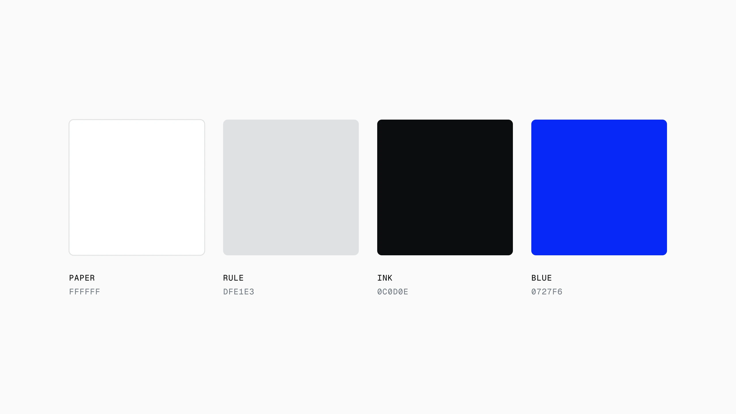
A palette of four is not a palette of four because four is a nice number. It is four because the fifth colour, every time it was tried, had to be explained, and a colour that needs a sentence to justify it is a colour the system will spend years apologising for.
Reduction is a second pass
The first pass is generous on purpose. You cannot remove what was never there, and a system that was minimal from its first sketch is usually just unfinished. The second pass is the one that earns the word: each element is asked what breaks without it, and the ones that cannot answer go.
Edit on paper
It helps to run that pass on a printout, or on a screen you are not allowed to edit. When the cursor is right there, removing something feels like losing work. On paper, with a pen, it feels like what it is: editing. The things you circle twice are the system. The things you skip over are decoration you had stopped seeing.
- If two things do one job, keep the quieter one.
- If a rule needs an exception on day one, it is not a rule yet.
- If nobody would notice it missing, it is already missing.
- If it only looks right at one size, it does not look right.
What restraint costs
Restraint is slower. A page with one typeface and two weights has nowhere to hide a weak sentence; the hierarchy that a third weight would have faked has to come from the writing, the spacing and the order instead. Every shortcut a bigger toolkit offers is a shortcut the small one closes.
The review problem
It is also harder to defend in a review. A busy screen looks like effort. A quiet one looks, at a glance, like nothing happened, and the hours that went into deciding what not to draw do not show up in a screenshot. The only argument for it is the one users make without words: they find things faster, and they come back.
The point is not to have less. It is to have nothing left that is pretending.
More or less
Less is not always more. Sometimes less is just less, and the page is thinner for it. A settings screen stripped to three options is not elegant if the fourth was the one people came for. The test is not the count; it is whether what remains carries more than what was there before.
When it does, something odd happens: the system gets quieter and louder at the same time. Quieter, because there is less of it. Louder, because each thing that is left has the room to say what it is for. That is the trade, and on most projects it is the right one. More or less.